10 Landing Page Mistakes That Kill Your Conversions
Let’s be honest, you know your landing page can do better but there’s just something that’s going wrong and you can’t put your finger on it. Here’s a list of some of the most common landing page mistakes and how to fix them to improve your conversion rates.

Do you have an up and running landing page? Do you have a lower conversion rate compared to the number of unique visitors to the page?
Fret not, as these can be fixed in a matter of minutes, hours at max. Here are some of the most common landing page mistakes that will help you build an effective SaaS landing page.
Common Landing Page Optimization Mistakes
Here are some of the most common mistakes on a landing page that might give the visitor a bad experience and cost you a lead.
Slow loading time

Nobody likes to wait. Especially on a product page when you’re in the zone, trying to commit to a product and the items on the website jarringly move as new items pop in or just flat out loads the entire page when the last item has loaded. A slow site not only makes the browsing experience frustrating but also ranks your site worse on Google. If a site takes longer than three seconds to load, there’s a good chance you’ll lose 53% of your visitors.
Quick fix to a slow landing page:
- Check and correct incorrect JavaScript implementation
- Resize and compress images, opt for JPEG over PNG
- Resolve excessive HTTP requests
- Opt for a new website host
Unclear/excessive CTAs

We get it, the point of a landing page is to driver conversions up. But if you hit the visitor with a “Subscribe” or a “Buy Now” button every 5 seconds or every time they scroll a bit, they might get repulsed by the button and choose to ignore it once and for all.
Quick fix for unclear CTAs:
- Choose a strong and emotive headline to capture the viewer's attention.
- Opt for bright and contrasting colors to help your CTA stand out.
- Explore sticky CTAs, as it is persistent but non-intrusive.
- It is a best practice to have one CTA per fold.
- Use CTAs sparingly, but wisely.
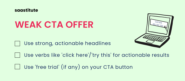
Weak CTA offer

Even if you’re clever about your CTA placement, you need to convince a random person over the internet, to use your SaaS product. You might have something unique to offer, but to truly convince the prospect, you need to make them an offer they can’t refuse.
Quick fix for weak CTA offer:
- “Join the world’s FASTEST VPN” or “Join a fleet of 5 million satisfied users worldwide” are strong actionable headlines.
- “Try XYZ for 2 months, it’s on the house” is a strong incentive to the prospect to sign-up
- Use verbs like “Try XYZ” or “Click here” to get your audience to take action
- If your product offers a free trial, use this message on the CTA button
Too much information

To get a full picture of your product, your landing page should show just enough information to have the viewer interested. But sharing every little detail about the product isn’t exactly the right way to go. Think about it, if you were buying a car, you’ll rarely go into specifics such as the car’s spark plug model number or the oil filter type. You’ll instead focus on legroom, safety, mileage, and so on.
Quick fix for asking/providing too much information:
- Stick to providing the product details through e-mail or on a separate page.
- Focus on your product’s highlights and strengths.
Broken links

According to a study by Small Biz Genius, 88% of users say they won’t return to a website after having a bad experience. Imagine if your prospective buyer is interested and clicks on a downloadable for the product, and the link is broken. There’s a good chance that they will start looking for alternatives or at least have a bad impression of your product/company.
Quick fix for broken links:
- Check every CTA, downloadable and outbound link on your landing page.
- Use semrush‘s backlink audit to find and fix broken links.
Bad social proof

According to a report by Nielsen, 70% of visitors will trust a review from a stranger on the internet. So why not use the odds in your favor? Word of mouth is too strong of a marketing tool to overlook. Hearing positive feedback from peers in the same field can sometimes be all that it takes to bag a new customer. But avoid poorly optimized social proof as this can look unprofessional. A poorly optimized review would be a review that only says “Good product, I like it” or “Works well”. While these reviews are positive, they don’t provide your prospect with any insightful information.
Quick fix for bad social proof:
- Highlight reviews that talk about a product feature, for example, process speed or memory usage.
- Include the reviewer's job role and company, as this helps in relatability and reliability.
- Don’t include lengthy reviews. Keep the reviews short, about 20 to 50 words.
- Don’t buy reviews, as users can see through the bullshit.
Poor mobile optimization

As of January 2022, 55% of a website’s traffic comes from mobile devices, whereas desktop traffic clocks in at 42%. Designing a website for mobile compatibility is a process that can’t be overlooked, as Google ranks websites that aren’t mobile-friendly lower than those that are.
Quick fix for poor mobile optimization:
- Use short but clear words as to what you can offer so as to not take up too much space on a smaller screen.
- Run your landing page through the Google Search Console’s Mobile-Friendly Test and see how it tests out.
- Limit the number of buttons as they might clutter up a small screen.
Vagueness

You might want to be mysterious to pique the customer's interest and reel them in, but this comes off as a facade and as you’re filling the space with irrelevant information. The landing page’s purpose is to convince the prospect to fully commit to the product you’re selling.
Quick fix for vague messages:
- Stick with the less is more principle and choose to convey the most relevant information in the least words possible.
- Order the information in a hierarchy so it’s easier to digest it.
Excessive jargon

Your SaaS product might have the technical abilities to leave the competitors in the dust, but if you can’t convey this without getting the visitor confused, you’re one step closer to losing a lead. Too much technical jargon and numerical figures can be overwhelming and confusing.
Quick fix for excessive jargon:
- Simplify pricing and plan structure so it’s easier to compare multiple plans.
- Use strong but simple words to convey your unique selling proposition.
- Simplify the technical aspects of your products.
Lengthy lead capture form

The prospect can still change their mind after they’ve engaged with your CTA. A lengthy sign-up form is a dealbreaker for anyone on a time crunch. A short sign-up form is a sight to sore eyes as the data needed will be auto-filled and it’s a matter of submitting. If the form requires information such as home address, credit card details, and such, the prospect might also be discouraged to proceed as they would not be comfortable sharing all that information in one go.
Quick fix for lengthy lead capture form:
- Have the form visible as a sticky form to ensure better visibility.
- Initially, stick to only asking for their names and e-mail.
To wrap it up...
Landing pages are all about one goal, and that is to drive your conversions up and channel more leads into the sales funnel. With this list, you can implement changes to your landing page in no time and ensure that your user has the best experience while visiting your page.
While your landing page may have none of these mistakes, your conversion rates could still be low as you might not be following some best practices to increase conversions.


.svg)


