

CTA for SaaS Websites In 2021
Read our exclusive research on the CTAs of over 100+ SaaS companies of various sizes—to provide you with some powerful perspectives.
.png)
Every day on the internet, we stumble across hundreds of call-to-action (CTA) buttons as “Subscribe to the newsletter,” “Speak to us,” “Download whitepaper”, “Watch the webinar,” or something like “Create account” or “Get Started”. They can be seen on a website homepage page, promotional banner, sales copy, blog page, PPC ad or email, acting as milestones that marketers create to inspire visitors to take specific actions.
In this article, we take a look at some of the trends on B2B marketing CTAs and what works well for SaaS websites. This is a rather expanded analysis that looks at the CTAs of over 100+ SaaS businesses of all sizes, so we’ve broken it down into a few core sections you can jump straight to:
- An overview of Call-to-Action
- Designing a CTA that converts
- What copy to use in a CTA?
- What color to use in a CTA?
- Where to place a CTA?
- What shape to give to a CTA button?
- How many CTA(s) to use?
CTA overview
As B2B marketers, we spend a lot of time figuring out what and how elements should go on a website, and interactive elements like CTAs help attract more leads and clients. According to Unbounce, more than 90% of visitors who read your headline also read your CTA copy.
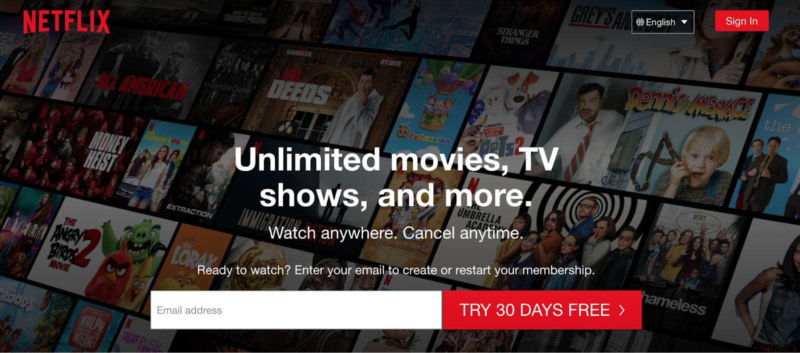

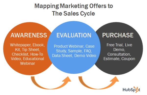
The CTA varies depending on the type of business, for example a B2B company most commonly uses “Get 14 days trial of X”, “Get pricing”, etc., whereas in a B2C business, CTAs such as “Buy Now” and “Create Your Account” are widely used. These CTAs usually reflect the prospect’s position in the marketing funnel and are intended to equip them with the tools and resources they need to progress to the next stage of the funnel.
For instance:
- Awareness: Read More
- Consideration: Download Whitepaper
- Decision: Schedule Demo
- Retention: Upgrade my membership
- Advocacy: Write a review
Designing a CTA that converts
When designed well, CTAs serve two purposes- guide the visitor on the website like a discreet tour guide, and represent a crucial element in the conversion flow. Being such a crucial component of every landing page, it is the topic of much discussion. The key decisions to be made for a CTA are-
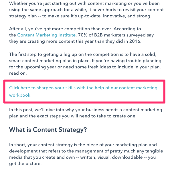
- What text to use in a CTA?
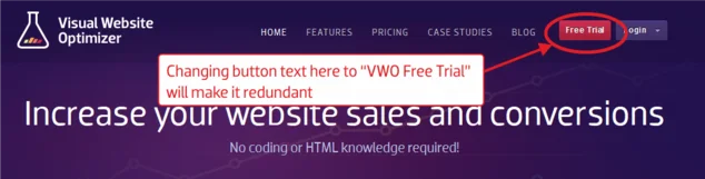
The copy in the CTA should answer “ Why should I click this button? ” The text should be such that it makes sense even without much context. A/B testing SaaS tool, VWO recommends to stray away from generic and vague CTA, but not every time.
It’s important to keep the CTA copy short and clear, with the length ranging anywhere from 1 word to 7 words. According to Hubspot, over 90% of CTAs are less than 5 words in length.
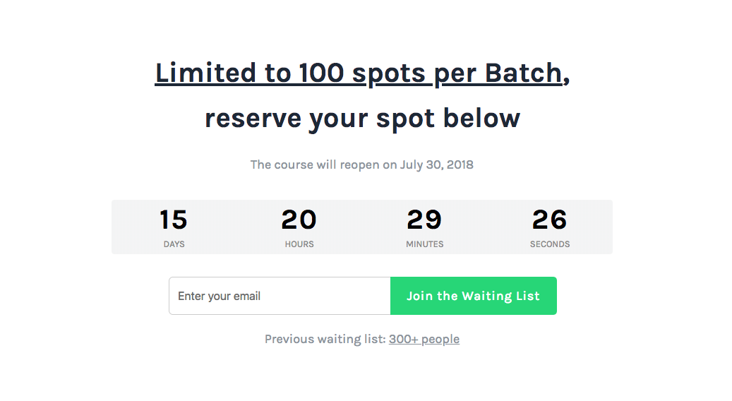
Using urgency to hack conversion rate has never disappointed marketers. For instance, using phrases like “Limited time offer”, “Quick, reserve your seat”, and such.
Sometimes, marketers give two options to choose from. Look at Kissmetric’s case study landing page and how they provide two options to the visitors in a very guilt-tripping language like “Yes, Get me the FREE Case Study now” or “No, I am all set for right now. Maybe later”.

If you noticed here, the “Get me the FREE Case Study Now” is intentionally kept brighter and inviting in look than the other option.
- What color to use in a CTA?
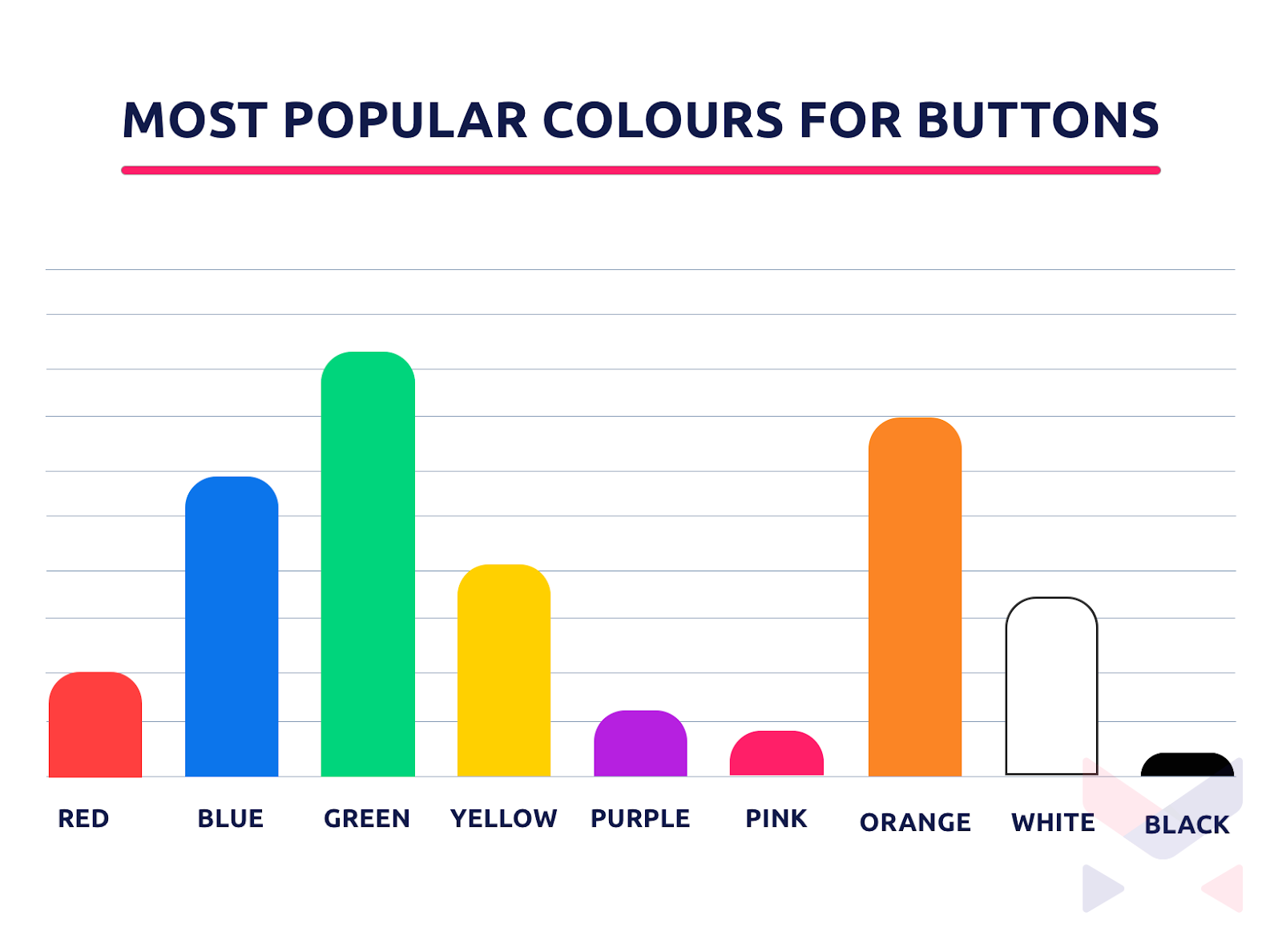
Even if more than 70% of SaaS websites have either a green or a blue CTA, I think there is no “one-size fits all”.
For instance, a Blue CTA won’t work on a blue background, as it will almost merge with the background and fail to capture the attention it needs. The idea is to keep the color of the button in stark contrast to the website color scheme, perhaps the color that matches with the logo or hasn’t been used anywhere on the page.
Rafflecopter and Monday understand this very well. Sometimes, marketers add small cues above/below CTA(s) that can possibly make a huge difference to their conversion rate.
- Where to place it
CTA’s position varies from site to site. However, statistics suggest that about 37% of the studied websites keep the CTA on the right side, while 29% in the middle and rest on the left.
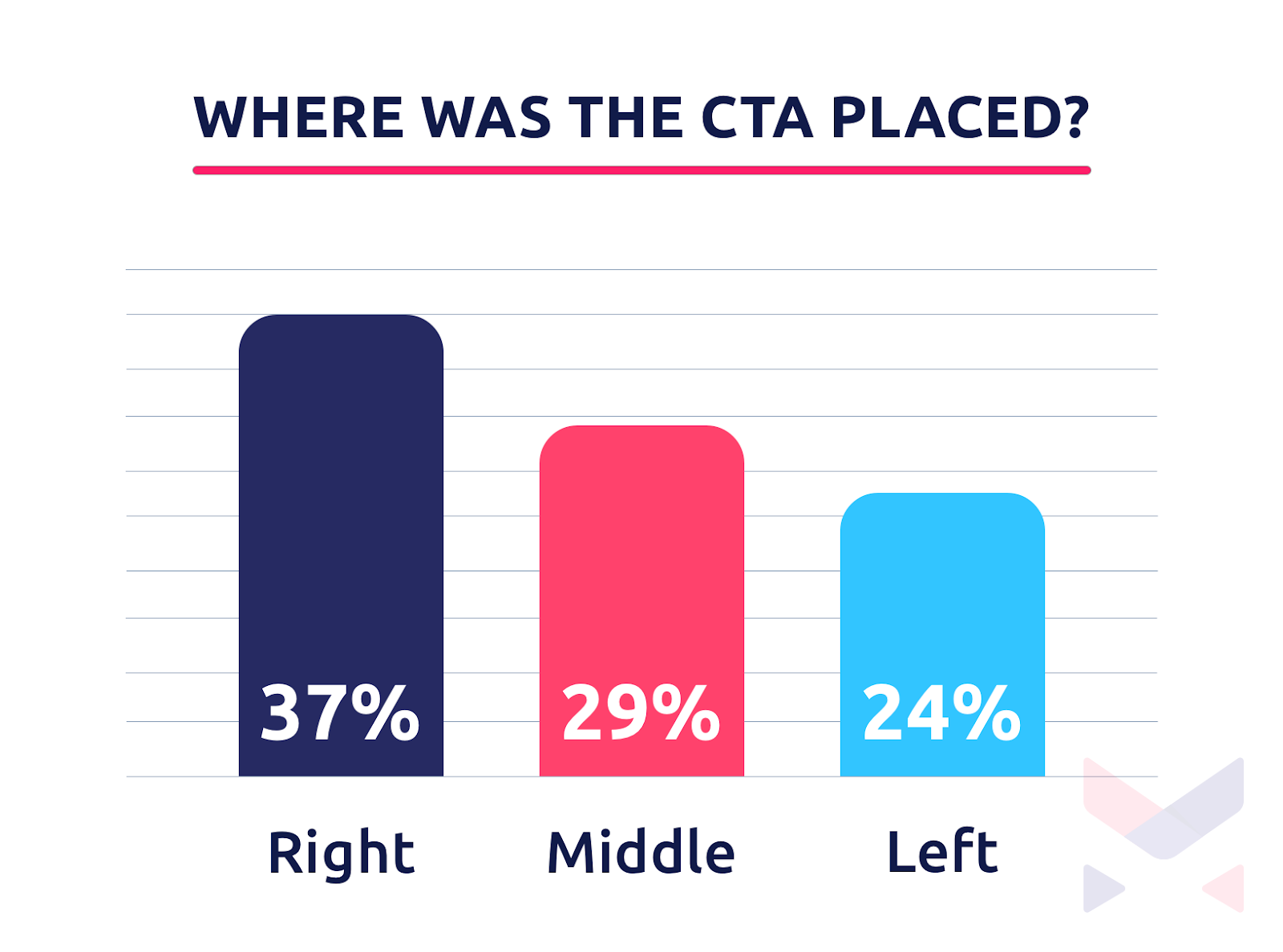
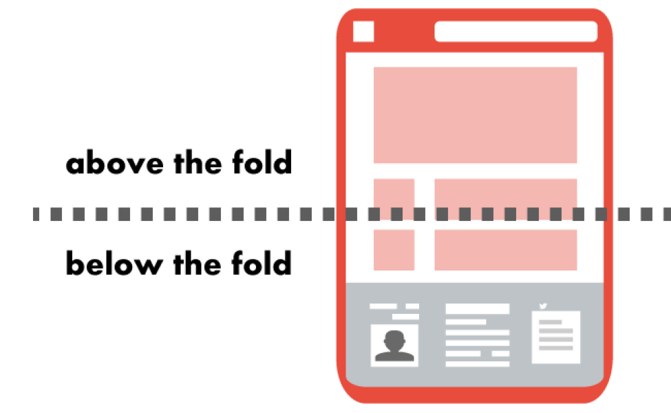
While there is no golden rule as to where to place the button, its timing is the most important aspect of the website. Another point of discussion is “the fold”, whether to place it above or below the fold.
“..the fold is just a myth. Many times moving the call-to-action below the fold has shown to have a higher conversion rate.” -VWO
Marketers recommend taking the call according to when the visitor is well-prepared for the action using text and/or video content, as the probability of the visitor clicking on the button after being well informed increases.
- What shape to give to a CTA button?
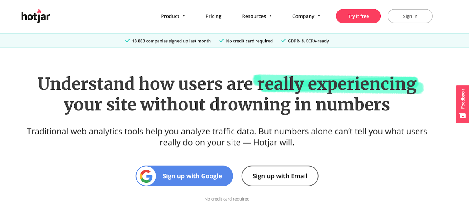
Well, the bigger the size, the better, but adjusting the size of the button if you have more than one of them, makes more sense. See how Proposify and Hotjar keep their primary CTA and secondary CTA distinctive.
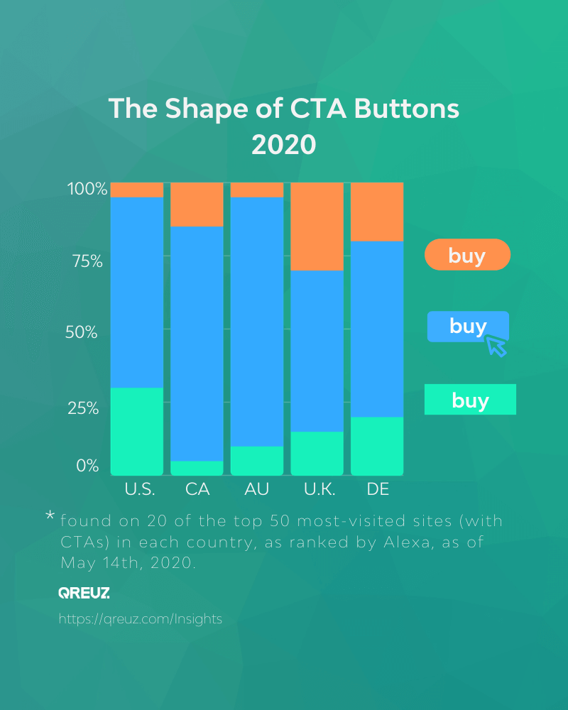
According to Qreuz, 20% of the CTA buttons on the most-visited sites in the U.S. are rounded and 20% are rectangular shape with “hard” corners. The most popular CTA button shape on the U.S. sites in this study is rectangular with “soft” corners.
- How many CTA(s) to use?
A study on 1,000 SaaS company websites suggested that none of these websites had less than one call-to-action (this might sound obvious, right?). WordStream found that email copies with a single CTA could boost clicks by 371% and sales by 1617%.
So, any marketing asset businesses (B2B or B2C) must have some sort of call-to-action on the page. Even if it’s as simple as a “Schedule Demo” or “Learn more” button on a website, calls-to-action have proven to be wildly effective.
Depending on the goal of the webpage, the number of CTAs varies. Here’s what most of the industries and businesses follow - list as many or as few calls-to-action as they feel necessary to align with their strategy and meet their objectives.
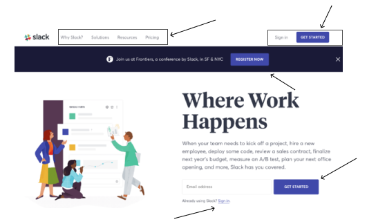
Homepage CTAs
The function of the homepage is to direct visitors around the site and it is therefore likely to have more than one CTA. Possibilities include users who wish to learn a bit more about the product/service features, view a product demo video, or try out the product, so adding CTA(s) will help them navigate to the particular pages and lucrative offerings.
The most common CTAs for a homepage are-
- Get Started
- Sign up
- Try X for Free
- Get a Demo
- Learn more
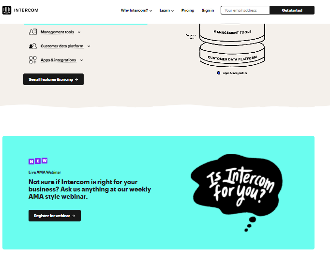
Product Page CTAs
Visitors landing on this page could be broadly categorized into two types- visitors who are at their decision stage and visitors who are at their consideration stage. Given that, the CTA on the website should be able to encourage both kinds of visitors.
Prospective buyers might come on the product overview page to obtain an answer for “How does this product work?” or “How can I get a trial of this product”. For these, the website needs to have a prominent CTA that gets these handraisers.
While on the other hand, visitors who are far from making purchases might be interested in reading Tofu or Mofu content. It’s recommended to direct them to content landing pages such as as- eBooks, blogs, thought leadership, case studies, webinars, etc. through a strong CTA.
Intercom, for example, has put a webinar banner right below the product features on its product page . This is a great way to generate leads and get them to register with a CTA.
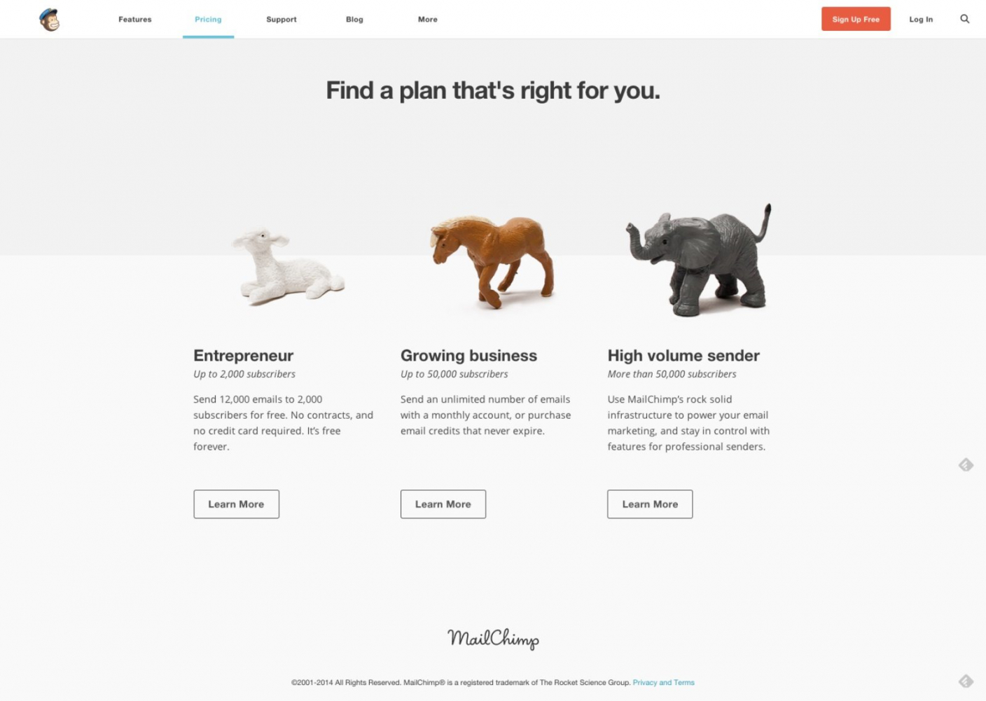
Pricing Page CTAs
The pricing page of SaaS companies usually has multiple CTAs. Visitors on this page need to be fed with the right amount of price-related information to help them make an informed decision.
You need a CTA button at the bottom or top (A/B test this) of every pricing plan, just like Mailchimp and Uservoice does in this example:
Further Reading
I would strongly recommend these articles if you’re interested-
- Take a look at Hubspot’s and WishPond article to find CTA inspiration. Also, SaaSPages showcases some of the best CTA blocks.
- This article by Buffer is a great list of power words/phrases you might want to try.
- For a great quick read if you're a bit short on time: Read this
- If you are interested in reading which CTA button converts the best, read this article
- If you are still confused about the color you want to use in the CTA buttons, this article on CTA color theory might help
- An Exhaustive list of websites with compelling CTA by Hubspot


.svg)


